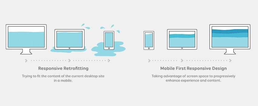
A. Mobile-first approach
The mobile-first approach has become a cornerstone of responsive web design, and for good reason. With mobile devices accounting for over 50% of global web traffic, prioritizing mobile design is no longer optional — it’s essential. Here’s why the mobile-first approach is crucial and how to implement it effectively:

Why mobile-first matters
- User experience: Mobile users have different needs and behaviors compared to desktop users. By designing for mobile first, you ensure that the core content and functionality are optimized for smaller screens and touch interactions.
- Performance: Mobile devices often have slower internet connections and less processing power. A mobile-first approach encourages developers to focus on performance optimization from the start.
- Search engine optimization: Google uses mobile-first indexing, meaning it primarily uses the mobile version of a website for ranking and indexing. A well-designed mobile site can improve your search engine rankings.
- Future-proofing: As mobile usage continues to grow, designing with a mobile-first mindset ensures your website remains relevant and accessible to an ever-expanding mobile audience.
Implementing a mobile-first approach
To successfully implement a mobile-first approach, consider the following strategies:
- Start with the smallest screen: Begin your design process by creating layouts for the smallest screen sizes first, then progressively enhance the design for larger screens.
- Prioritize content: Identify the most critical content and features for mobile users and ensure they’re easily accessible on smaller screens.
- Use progressive enhancement: Add more complex features and visual elements as the screen size increases, rather than trying to cram everything into the mobile version.
- Optimize for touch: Design interface elements with touch in mind, using appropriately sized buttons and touch targets.
- Test extensively: Regularly test your design on various mobile devices and screen sizes to ensure a consistent experience across different platforms.
B. Fluid layouts and flexible grids
Fluid layouts and flexible grids are the backbone of responsive design, allowing content to adapt seamlessly to different screen sizes. Let’s explore these concepts in detail:
Understanding fluid layouts
Fluid layouts use relative units (like percentages) instead of fixed units (like pixels) to define the width of elements. This approach allows the layout to adjust proportionally to the screen size, maintaining the overall design integrity across devices.
Key benefits of fluid layouts include:
- Adaptability: Content automatically adjusts to fit various screen sizes without the need for multiple fixed layouts.
- Improved user experience: Users can view content without horizontal scrolling or zooming on smaller screens.
- Easier maintenance: A single fluid layout can replace multiple fixed-width designs, simplifying updates and reducing development time.
Implementing flexible grids
Flexible grids take the concept of fluid layouts a step further by organizing content into a grid system that can adapt to different screen sizes. Here’s how to implement flexible grids effectively:
Create Responsive CSS Grid Layouts with GRID WRAPPING
- Use CSS Grid or Flexbox: These modern CSS layout systems provide powerful tools for creating flexible, responsive layouts.
- Define grid areas: Organize your content into logical grid areas that can be rearranged based on screen size.
- Set breakpoints: Determine key screen sizes where the layout needs to change and use CSS media queries to apply different grid configurations at these breakpoints.
- Utilize fractional units: Instead of fixed pixel values, use fractional units (fr) in CSS Grid to create flexible column widths that adjust proportionally.
- Combine with fluid typography: Implement responsive typography that scales with the layout to maintain readability across devices.
Click Here for more detail
